Coda's New Look: The End of the Maker Era?

A tough-love deep dive into the latest usability refresh.

Coda, the beloved LEGO® set for doc-nerds and spreadsheet-despisers, just got a makeover. On the surface, it’s all minimalist chic, consolidated menus, and a clean aesthetic that practically begs for mainstream approval. But don’t be fooled by the fresh coat of paint. Beneath it lies a strategic pivot, a calculated neutering that should make every power user deeply suspicious despite their equally intense love for this platform. I know. I am this user. A maker from the beginning and an advocate for a technically competent tool that blends text, imagery, AI, and data - all in a single platform that can be used to build polished domain-specific solutions.

Nothing about today’s UX refresh prevents me from continuing to use Coda as I always have. But there are non-trivial changes that impact my seemingly irrational devotion.

The question isn’t whether the new UI is prettier—it is. The real question is whether Coda, in its bid for mass-market appeal under the new Grammarly empire, is sanding down the sharp, powerful edges that made it essential, leaving a lobotomized tool that’s friendly to everyone but truly less useful to Makers who create streamlined workflows and use Coda as a business solution platform.


The Grammarly Imperative: Why Your Coda Is Being Dumbed Down

Let’s be brutally honest: this UI refresh isn’t some benevolent act of design altruism. It’s a cold, hard business move, a direct consequence of Coda’s assimilation by Grammarly. Facing an existential crisis as LLMs make its core spell-check business seem quaint, Grammarly is frantically assembling a Voltron of productivity apps. It grabbed Superhuman for email, and it swallowed Coda for its collaborative canvas.


It’s Not Email; Its a Story

December 19, 2024
Read full story


The endgame is an “AI agentic platform,” a utopian vision where AI agents work together in a unified space. But to sell this dream to Grammarly’s 40-million-plus daily users—an audience far broader and less technical than Coda’s “maker” cult—Coda had to be declawed. This refresh is Step One in domesticating the wild beast Coda once was, making it safe and palatable for the masses. It’s a strategic necessity for Grammarly, but it feels like a tragic dilution for Coda’s most loyal builders who probably weren’t paying the bills anyway.

This UI refresh is therefore a strategic necessity to lower the barrier to entry… It prioritizes approachability for new users, sometimes at the expense of power-user efficiency.


A Tour Through the ‘Improved’ Coda: Hits, Misses, and Outright Insults

Coda’s announcement is a festival of corporate buzzwords like “focus” and “clarity.” Let’s translate that marketing fluff into reality and see who wins and who loses.

Blank Doc Experience: A Quieter, More Patronizing Welcome

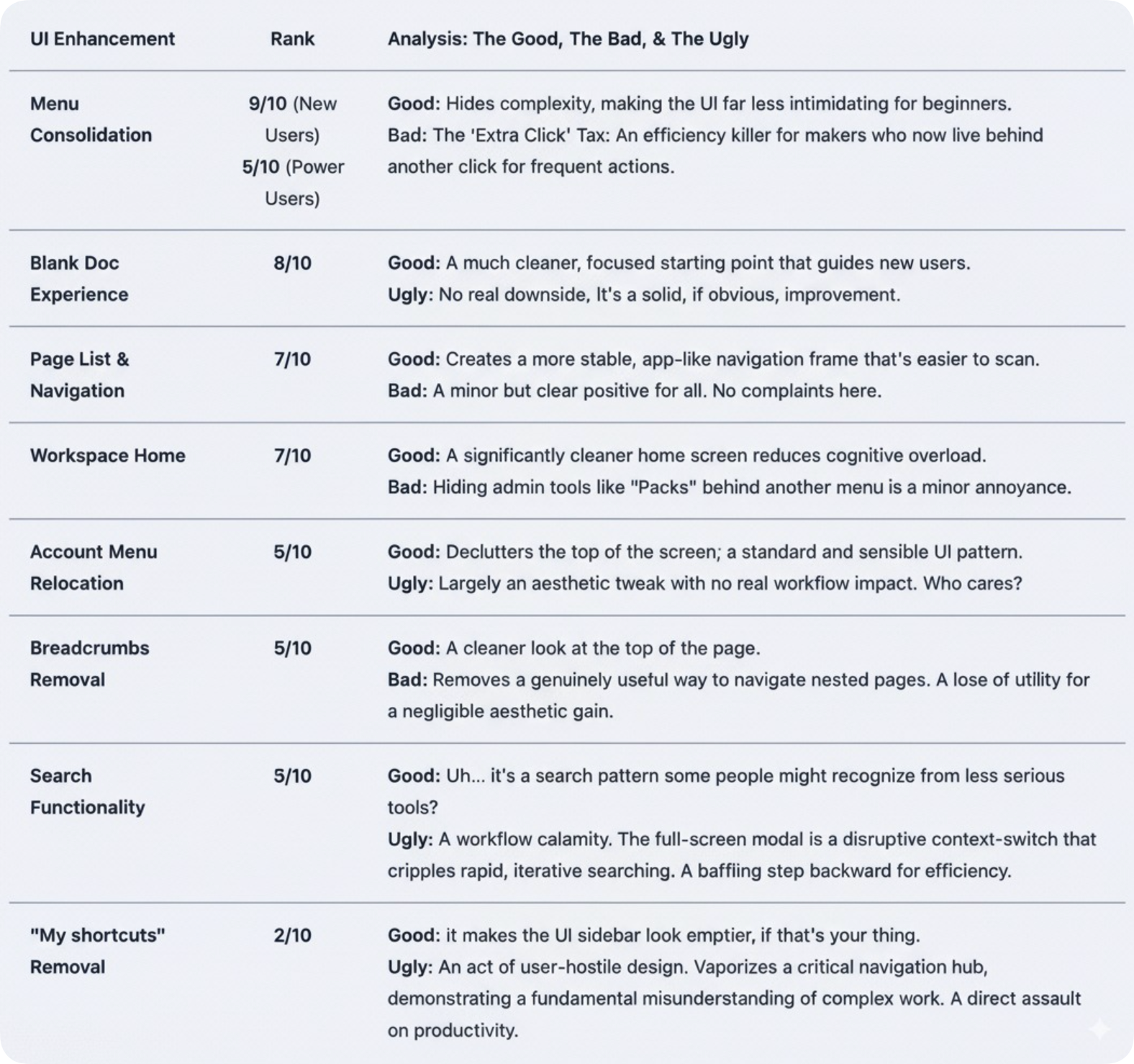
The chaotic template tray is gone from the blank doc view. Newcomers now see a clean slate and an “Insert Panel” pointing them toward basic blocks. This is an undeniable win for first-timers, who are no longer hit with a paralyzing wall of options. For power users? It’s a shrug. A perfectly logical, if uninspired, change. I like it. Most Makers probably won’t. Moving on.

Menu Consolidation: The Ministry of Hidden Options

Doc Settings, Page Options, and Table Options have been neatly tucked away into single “Options” menus. Visually, it’s a minimalist triumph. Functionally, it’s a death by a thousand papercuts. For the “makers” who live in these menus, this introduces a small but infuriating “extra click” penalty. Each click is a micro-interruption, a tiny grain of sand in the gears of a complex workflow that, over a day, accumulates into a mountain of friction.

Search: A Jarring Act of Disruption

The ever-present, top-center search bar is gone. To find something, you now click a left-panel icon, summoning a full-screen modal that yanks you out of your flow like a poorly timed pop-up ad. This is perhaps the most egregious offense against power-user muscle memory. The old search was immediate and in-context. The new search is a disruptive, screen-hogging event. It’s the digital equivalent of having to get up and walk to a different room just to ask a question—a design pattern that is objectively slower for rapid work.

“My shortcuts” Removal: Organizational Vandalism

In a move that feels like a direct slap in the face to anyone who values organization, the “My shortcuts” panel has been vaporized. This was the user-curated command center for navigating complex workspaces. Its removal is a high-risk gamble that demolishes ingrained workflows and forces reliance on the whims of “Recents.” It’s a baffling act of organizational vandalism, sacrificing user agency for a misguided sense of “cleanliness.”


The Ranking: A Brutally Honest Scorecard

Here’s how the new UI features stack up when you peel away the marketing veneer. We’ve ranked each change by its real-world impact, striking a balance between catering to new users and supporting the workflows of seasoned pros.

What The Makeover Doesn’t Fix: The Rot Under the Floorboards

Here’s the most essential truth of all: this UI refresh is cosmetic surgery on a patient with systemic organ failure. While Coda has been busy rearranging the deck chairs, the engine room has been flooding.

The community’s biggest complaints have nothing to do with the search bar’s location. They’re about foundational problems that make Coda unusable at scale.

  • Performance & Scale: Users consistently report that as docs grow, Coda slows to a pathetic crawl. Tables with a few thousand rows become unresponsive. The 125MB API limit is a hard ceiling that forces serious teams to abandon Coda’s data layer entirely.

  • API Reliability: The API is seen as a “major single point of failure.” Teams that build critical infrastructure on Coda simply don’t trust it.

  • A Ghost Town Mobile App: The mobile experience isn’t just bad; it’s an embarrassing, forgotten relic. In an age of hybrid work, it’s a critical failure.

As one user bluntly stated, their engineering team’s only solution from Coda was “to move our data to another platform.” When your vendor’s advice is to use another product, you don’t have a product; you have a billboard for your competitors.


Conclusion: A Fork in the Road for Coda’s Soul

The Coda UI refresh is a logical, well-executed maneuver to prep the product for the mainstream objectives under the Grammarly banner. It succeeds in making Coda look simpler. But this veneer of simplicity is paid for with the currency of power-user efficiency, and it deliberately ignores the foundational rot that actually threatens the platform. I get it. There are many gears and dependent cogs that must be aligned to tackle the architectural hurdles necessary to scale.

The changes reveal a company at a crossroads. Will it chase the mass market by continuing to blunt its features, becoming a prettier but dumber-by-default version of its former self? Or will it use its new war chest—a rumored $1 billion—to finally fix the deep-seated issues of performance, scale, and reliability that its most loyal users are screaming about?


Coda’s Future Demise

November 25, 2024

I predicted Coda’s demise in early 2024. Not the actual date, but the likely eventual demise. I questioned the AI strategy and told the Codans to pump the breaks. But my deeper predictive senses about the future were captured in an article never published.
Read full story


Today’s UX refresh might attract new eyeballs, but Coda’s reputation was built on the backs of “makers” who pushed it to its limits. By disrupting their workflows while ignoring their cries about the platform’s core failures, Coda risks alienating the very community that gave it a soul. And a soul-less tool, no matter how pretty, is just another disposable app in a graveyard of good intentions.

It’s possible the Maker era was never financially sustainable, or in light of the rapid advance of generative AI, the Maker cult is destined to be vaporized. I’m pragmatic about the end of everything. Perhaps this step is a harbinger of AI disruption.

15 Likes

In economics, it is known as “enshittification”….

Really.

2 Likes

Not sure why all the negative sentiments.

Nothing has been dumbed down. All features that used to be there are still there (maybe except those favorites but I wouldn’t know, I don’t use those favorites). Things have just been rearranged for a cleaner UI. If anything, some of the past additions (e.g. the ‘add calculated column’ with a pre-set formula or the Compose column) were much more guilty of ‘dumbing down’ the workflow than this UI retouch here.

I’ve been in this new UI beta for over a month now and never have I felt any discomfort working with Coda (except maybe in the very early days of the beta, but they’ve already changed those)

11 Likes

I have a much more tactical observation/request that has been a negative for me with the new update - I’ve really loved the linking functional (particularly linking to a view with personal filters). This has disappeared with the new update and I’m not sure if it’s hidden or if it’s just now gone. Any pointers on where to find it?

Old View:

:wave: @Jon_Olson1

This can be found:

Left panel, click the 3 dots of the page, then copy link to page

Hope this helps!

Cheers!

Mel

5 Likes

Don’t agree.

Love the updates. Consider myself a power-user. Love it for myself and clients

5 Likes

The negative sentiments exist because Coda has been Maker-centric since its inception, and these UX changes generally skirt the vast majority of the community’s desires, as documented in several threads. The community, of course, is also deeply biased toward Makers.

Writing this on behalf of Makers compelled me to score these changes relatively high because they were executed pretty well. But, with significant unaddressed issues, should this moment allow them to skate on the many critical issues that are deeply needed by patiently waiting Makers?

Just because Grammarly must now drop the Maker era to accommodate a user-centric cohort, it doesn’t give them a pass. Makers have been diligently building their businesses based on partially complete feature sets. Failing to address these issues while investing in softer experiences is not ideal, as it also acknowledges that this is not a bed of roses.

I have adapted pretty well to the new UX. I have not adapted to the limited table size. :wink:

2 Likes

I do as well. But this article isn’t about the good stuff we love. It’s about the end of the Maker era, where every user will likely pay, and Makers are likely to be free over the horizon.

1 Like

I think it’s gone.

Do you regard this as more of a Maker feature?

For the most part, and I said that. If you’re a Maker, the perception is that the experience is ‘dumbed down’. This euphemism doesn’t mean the product is dumber or lacking features. It means the UI has been simplified for people who aren’t Makers.

This linking feature was apparently moved, thanks @Melanie_Teh.

2 Likes

I am in the same boat. I am not a “power maker”, preferring to work closer to the no-code model. However, having Coda grind to a halt on a table of 30,000 rows is not ideal. (Which is the number of batch jobs in our SAP system, which I am trying to get a handle on.)

Waiting for years for the “4 phases” of page sharing to be implemented, is also frustrating. I have a rather large knowledge hub of SAP system documentation. It would be great to share portions of it with other business users. They will get absolutely lost in my doc, even I get lost sometimes. But it is a resource full of gold nuggets, only growing in relevance. Being able to build sync pages for specific users (e.g. Finance, Sales, Technical) would unlock major benefits to the business. My company is not known for their IT tech savvy users, meaning I need to carefully curate information/ knowledge for them. Unfortunately, that development has gone into radio silence.

Coda Brain would also have been a major benefit - It would mean that I could ingest Finance policies that drive SAP functionality into the doc(s), and make them be searchable. For example, our Capex policy describes what needs to be capitalised, and also the authorisation limits. We have a Mexican subsidiary. I built a PoC of a Capex Approval workflow, which would use the approval / authorisation limits as set out in the policy. Update the policy, and the workflow is updated. Keep the policy in English, and query it in Spanish.

All of these are done with the bare minimum of Coda Formula Language. But I keep getting hamstrung by the table row limitations, by the failure of the promised sync page functionality, by the disappearing of Coda Brain.

But, its just a ramble,
Rambling Pete

5 Likes

On a different tangent, Coda seems to be ignoring the market for makers making docs/ templates that can be sold over and over.

They are focusing on developing functionality that allows for a single entity to build a a Coda environment.

2 Likes

Lane posted the below three months ago. We have now received two of five. Hopefully in the next three months or so, we will see at least some progress on the next three:

And I do not expect full delivery within the six months Lane mentioned, I understand the time to be aspirational.

3 Likes

I don’t think they are, actually. It may appear to be the case during this interim transition. Still, there’s a bigger fish in the pan - they must first embrace all the acquired technologies in the context of paying customers for SuperHuman, Coda, and Grammarly. The revenue model for Coda is most foreign to the prosumer cohort that Superhuman and Grammarly address. This is why the ‘end of the Maker era’ is in the title.

This is not to imply that Makers are going away. More specifically, it’s to show that the future experience is not really about Makers. It’s more about consumers. Makers will continue to make, and users will be at the forefront of all product design and UX.

As to the aftermarket. I think @shishir deeply understands the requirements of an agentic future where no-code/prompt-skilled workers will want to build and benefit from repeatable solutions and services.

Packs will likely become more critical, not less. Despite the prosumer customer base, I believe the aftermarket will thrive, particularly once a unified customization framework emerges across all app surfaces.

4 Likes

Grammarly/Coda has discussed its intention to continue preserving our investments in Coda as makers.

My clients (who were initially spooked) and I remain convinced of this, based on what they have told us.

It is easy to become fearful during this period of change - the interregnum period - where every change is inspected minutely and every omission is speculated upon.

Grammarly valued Coda, not just for its document editing features, but also for its ability to automate business workflows, and for its ability to build packs to integrate almost any data source.

It would not be wise to eliminate those features or nullify all the solutions already built in Coda by advanced makers and less-advanced users alike.

They will need to reshape Coda to make it fit into the Grammarly ecosystem better. And this UX update shows how that journey has started. The new Grammarly Docs editor is another example (it is basically Coda sans Tables and Formulas).

So I remain confident and committed to Coda, and so do my fintech and aerospace clients.

However; I do encourage Coda to provide more of these reassurances alongside each of the new announcements. We do not want to lose makers or users for the sake of some clear direction.

Respect,
Max

5 Likes

And because of this, I intend to publish my first commercially-available Pack soon. I dabbled with Packs earlier and open-sourced most of my experiments, but I think we’ve entered a different era that has a promising future for semi-skilled AI artists like me. :wink:

4 Likes

I’m intrigued about your pack. Any chance you can give us a preview of what you’re working on? @Bill_French

This topic was automatically closed 90 days after the last reply. New replies are no longer allowed.